Why the 80s Aesthetic is Back and Bolder Than Ever
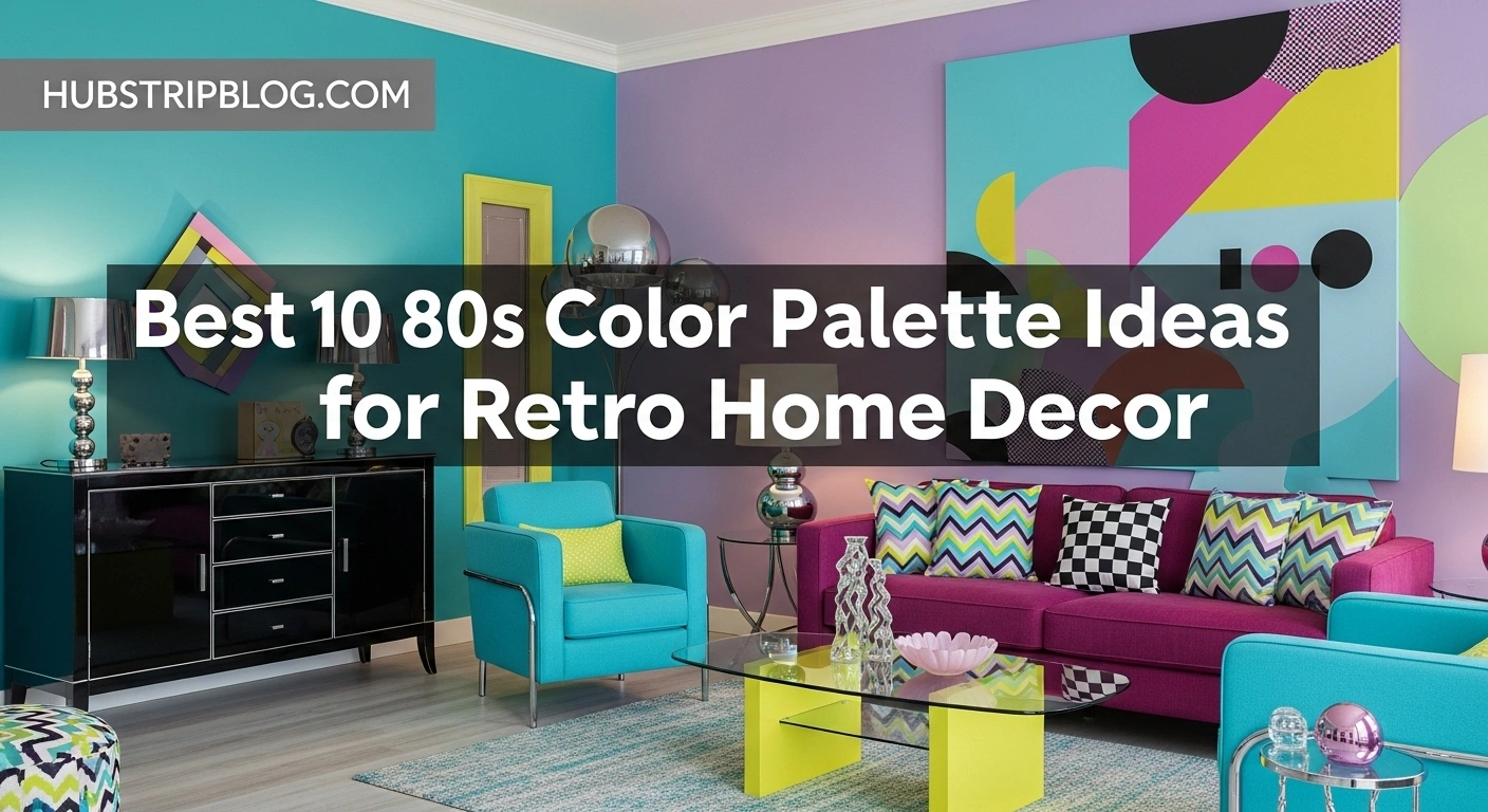
80s Color Palette Ideas – The resurgence of 80s design isn’t just a fleeting trend; it’s a celebration of optimism and individuality. This was the decade of the Walkman, MTV, and the personal computer’s rise. A spirit of futuristic excitement and economic confidence translated directly into design, resulting in confident shapes, geometric patterns, and, most importantly, a fearless use of color.
Unlike the organic, subdued styles that preceded it, 80s decor was all about making a statement. It was a visual playground that mixed Art Deco glamour with futuristic high-tech elements and a splash of pop art playfulness. This eclectic blend is precisely why it’s so appealing today. In a world of minimalist Scandi design and neutral farmhouse aesthetics, the 80s offers a refreshing and energetic alternative. It gives us permission to be bold, to have fun with our interiors, and to create spaces that truly pop.

The Foundations of 80s Color Theory
Before we unveil the top palettes, it’s essential to understand the core color families that defined the decade. The 80s weren’t monolithic; the aesthetic ranged from soft and romantic to loud and electric. Understanding these foundational groups will help you masterfully mix and match, allowing you to curate the best 80s color palette ideas for home decor that perfectly suit your personal style.
The Rise of Radical Neons
When you think of the 80s, your mind likely jumps to neon. Fluorescent greens, electric pinks, laser lemons, and vibrant oranges were everywhere. These colors screamed energy, youth culture, and cutting-edge technology. In home decor, they were often used as an electrifying accent to jolt a room to life, appearing in everything from lighting fixtures to abstract art.
The Supremacy of Saturated Pastels
On the softer side of the spectrum, pastels reigned supreme. But these weren’t your grandmother’s timid shades. 80s pastels were saturated and confident, often with a dusty or sun-bleached quality. Think Miami Vice—shades of flamingo pink, seafoam green, lavender, and powder blue were used generously, creating spaces that felt both dreamy and decidedly cool.
The Sophistication of Jewel Tones
For a more glamorous and upscale 80s look, designers turned to rich jewel tones. Deep teal, luxurious magenta, bold burgundy, and emerald green brought a sense of drama and sophistication. These colors were often paired with luxe materials like brass, chrome, glass, and velvet, a nod to the Art Deco revival that also characterized the era. They offered a mature counterpoint to the more playful neons and pastels.
The Top 10 Best 80s Color Palette Ideas for Home Decor
Now, let’s get to the main event. We’ve curated the most iconic and adaptable color combinations from the decade. Each of these represents one of the best 80s color palette ideas for home decor, offering a unique vibe and a clear path to achieving the retro look you crave.
1. The Memphis Design Pop Palette
The Colors: Primary Red, Cobalt Blue, Sunshine Yellow, Black, and White.
The Vibe: Playful, graphic, and audaciously artistic. The Memphis Group was an Italian design collective that rejected minimalism in favor of bold, cartoonish geometry and a primary-heavy color scheme. This palette is pure, unapologetic fun.
This is arguably one of the most iconic looks of the decade. The key to mastering the Memphis palette is the high-contrast interplay between bright primary colors and the starkness of black and white. Think of a room with white walls, a black-and-white striped rug, a cobalt blue sofa, and a pop of sunshine yellow in a quirky, geometric lamp.
To integrate this into a modern home, you don’t need to turn your space into a life-sized Pee-wee’s Playhouse. Start small. Introduce geometric throw pillows in these colors. Find a piece of abstract art that features bold red and blue. A single statement piece, like an armchair upholstered in a graphic black-and-white pattern with yellow legs, can be enough to channel the Memphis spirit without overwhelming the space.
2. The Sophisticated Mauve & Teal Mood
The Colors: Dusty Mauve, Deep Teal, Dusty Rose, and Grey.
The Vibe: Chic, sophisticated, and mature. This palette was the go-to for a more grown-up, elegant 80s interior. It was a reaction against the lingering earth tones of the 70s, offering a cooler, more contemporary alternative that still felt soft and inviting.
This combination is incredibly versatile and perhaps the easiest to adapt for a 21st-century home, making it one of the best 80s color palette ideas for home decor for those seeking a subtle retro touch. The coolness of the teal beautifully balances the warmth of the mauve and dusty rose, while grey acts as a grounding neutral. Imagine a living room with soft grey walls, a plush teal velvet sofa, and accent chairs in a dusty mauve fabric.
Brass or gold accents are the perfect finishing touch here, adding a layer of glamour that was so essential to the decade. Think brass-framed mirrors, gold-legged coffee tables, and elegant lighting fixtures. This palette proves that 80s decor could be just as refined as it was radical.
3. The Miami Vice Sunset Dreamscape
The Colors: Flamingo Pink, Peach, Seafoam Green, and Powder Blue.
The Vibe: Cool, breezy, and effortlessly stylish. Inspired by the sun-drenched aesthetic of South Beach and the iconic TV show Miami Vice, this pastel palette is pure escapism. It’s a softer, more relaxed take on 80s color that feels perpetually on vacation.
This is a fantastic choice for bedrooms and bathrooms, where the goal is to create a serene and airy atmosphere. Picture a bedroom with walls painted in a soft, sun-bleached peach. Layer in bedding with flamingo pink and powder blue, and add a few seafoam green accents through planters or decorative glass.
To keep it from feeling too sweet, introduce modern elements like light wood furniture, clean-lined decor, and plenty of white to keep the space bright and open. This palette works beautifully with natural textures like rattan and linen, bridging the gap between 80s retro and a more contemporary coastal or bohemian style.
4. The Neon Arcade Glow
The Colors: Electric Pink, Lime Green, Laser Lemon, and Black.
The Vibe: High-energy, futuristic, and rebellious. This is the 80s at its most electrifying. It’s the color of arcade games, synth-pop album covers, and Trapper Keepers. While drenching a room in neon might be a bit much for most, using it strategically can create an incredibly dynamic and fun space.
This palette is perfect for a home office, a creative studio, or a game room where you want to foster energy and excitement. The key is to use a dark, neutral base—like charcoal grey or black—to make the neon colors pop without causing a headache. A black accent wall with a custom neon sign in electric pink is a classic 80s statement.
For a less permanent approach, use neon in your accessories. A set of lime green dining chairs around a simple black table, a laser lemon floor lamp in a corner, or a gallery wall of prints featuring neon graphics can provide that jolt of 80s energy in a controlled, stylish way. This is one of the best 80s color palette ideas for home decor for those who aren’t afraid to be loud.
5. The Preppy Hunter Green & Burgundy League
The Colors: Hunter Green, Deep Burgundy, Navy Blue, and Cream.
The Vibe: Classic, academic, and comfortably upscale. This palette reflects the preppy, “yuppie” culture that was prominent in the 80s. Think ivy league libraries, cozy dens, and Ralph Lauren ad campaigns. It’s a traditional and timeless combination that feels both stately and inviting.
This palette is all about creating a sense of established comfort. It’s perfect for a living room, study, or dining room. Imagine walls paneled in rich wood or painted a deep hunter green. Bring in a classic leather chesterfield sofa and accent it with throw pillows in a burgundy and navy plaid. A cream-colored rug can provide a necessary lift, preventing the room from feeling too dark.
This look pairs beautifully with traditional furniture, brass hardware, and classic patterns like tartan and paisley. It’s an 80s aesthetic that whispers wealth and tradition rather than shouting pop-culture trends, proving the decade’s design diversity.
6. The Art Deco Revival Jewel Box
The Colors: Emerald Green, Magenta, Sapphire Blue, and Gold.
The Vibe: Glamorous, dramatic, and luxurious. The 80s saw a major revival of Art Deco style, but with a bolder, more saturated twist. This palette takes the jewel tones of the 1920s and amplifies them to an 80s level of intensity.
This is a palette designed for making a grand entrance. It’s perfect for a formal living room, a dining room meant for entertaining, or a powder room you want to turn into a “jewel box.” The combination of deep, saturated colors with the metallic sheen of gold or brass creates an opulent and theatrical effect.
Consider an emerald green lacquered console table, a magenta velvet armchair, or sapphire blue curtains. These intensely colored pieces should be treated like works of art. To balance the richness, use them in a room with neutral walls or incorporate reflective surfaces like mirrors and glass tabletops to bounce light around and enhance the glamour.

7. The Southwestern Pastel Desert
The Colors: Terracotta, Turquoise, Dusty Peach, and Sandy Beige.
The Vibe: Earthy, artistic, and relaxed. While neons and pastels were having their moment, another major trend was a stylized, pastel-infused take on Southwestern decor. It was less rustic than the 70s version and more about clean lines and soft, sun-baked colors.
This palette offers a warm and inviting atmosphere, making it one of the best 80s color palette ideas for home decor for creating a comfortable, bohemian-inspired space. The key is the interplay between the warm, earthy terracotta and the cool pop of turquoise. Dusty peach and sandy beige act as the soothing neutrals that tie everything together.
Use terracotta on a feature wall or through pottery and textiles. Introduce turquoise through accent pillows, a painted piece of furniture, or a patterned rug. This look loves natural light and pairs wonderfully with light-colored woods, leather accents, and, of course, a few well-placed cacti.
8. The High-Tech Chromatic Scheme
The Colors: Silver, Chrome, Primary Red, and Glossy Black.
The Vibe: Sleek, futuristic, and minimalist. This palette speaks to the decade’s fascination with technology, space travel, and the digital age. It’s a clean, industrial look that relies on material finish as much as color.
This aesthetic is perfect for a modern, minimalist home looking for a subtle retro edge. The foundation is built on reflective surfaces—chrome furniture legs, silver lamp bases, and high-gloss black lacquer. Primary red is used as a sharp, deliberate accent to inject a burst of energy and prevent the space from feeling cold.
Think of a living room with a low-profile grey sofa, a glossy black coffee table, and a sculptural arc lamp in chrome. The only color might be a single, bold red armchair or a piece of abstract red wall art. This is the 80s filtered through a lens of sleek, machine-age precision.
9. The Country Rose Garden Romance
The Colors: Dusty Rose, Sage Green, Baby Blue, and Antique White.
The Vibe: Romantic, charming, and sweetly nostalgic. This is the “Laura Ashley” side of the 80s. It was a hugely popular aesthetic, particularly in bedrooms and living rooms, that leaned into a romanticized English country style with a distinctly 80s color sensibility.
If you love shabby chic or cottagecore, this palette will feel both familiar and fresh. The combination of dusty rose and sage green is a timeless classic, while hints of baby blue add a touch of sweetness. The key to the 80s version is to go all-in on floral patterns, ruffles, and bows.
For a modern update, use the colors but pare back the frills. Paint a bedroom in a soft sage green and use dusty rose for the bedding and curtains. Incorporate antique white furniture to keep the look light and airy. You can still use a floral print, but perhaps choose a more contemporary, large-scale pattern on a single accent pillow or piece of art.
10. The Graphic Novel Contrast
The Colors: Hot Pink, Electric Cyan, Canary Yellow, and Pure White.
The Vibe: Bold, energetic, and visually striking. This palette feels like it was ripped from the pages of a graphic novel or a pop art print. It’s a slightly different take on neon, using purer, more saturated tones against a crisp white background for maximum impact.
This is another one of the best 80s color palette ideas for home decor for those who love to make a fearless statement. It works exceptionally well in kids’ rooms, creative spaces, or any area where you want to spark joy and energy. The formula is simple: keep the canvas (walls, main furniture) bright white, and then layer in powerful punches of hot pink, cyan, and yellow.
Consider a white room with a hot pink sofa as the undeniable centerpiece. Add a rug with a geometric pattern in all three colors. Use cyan for shelving and display canary yellow vases or frames. The white base is crucial—it acts like the blank page of a comic book, allowing the vibrant colors to tell a powerful story without becoming visually chaotic.
How to Weave 80s Palettes into a Modern Home
Embracing the 80s doesn’t mean your home has to look like a time capsule. The key to successfully using these bold palettes is balance. Here are some practical, modern strategies for infusing that retro magic into your space.
Start Small with an Accent Wall
If you’re hesitant to commit to a full-room color scheme, an accent wall is your best friend. Choose one of your favorite 80s shades—a deep teal, a dusty mauve, or even a daring primary yellow—and paint a single wall. It’s a high-impact, low-risk way to introduce the era’s character into a room.

Focus on Textiles and Accessories
This is the easiest and most flexible way to experiment. You can completely change the vibe of a room just by swapping out textiles.
The Power of Throw Pillows and Blankets
Drape a neon pink throw blanket over a neutral grey sofa. Add a collection of pillows in a Memphis-style geometric pattern to your bed. These small touches are inexpensive and allow you to play with the boldest of the best 80s color palette ideas for home decor without long-term commitment.
Statement Rugs and Curtains
A larger textile, like a rug or a set of curtains, can anchor a room’s color scheme. Find a rug that incorporates the pastel shades of the Miami Vice palette to instantly soften a living room. Or, choose curtains in a rich hunter green to add a touch of preppy sophistication to your study.
Update Furniture with a Splash of Audacity
Give an old piece of furniture a new lease on life with a coat of 80s-inspired paint. A vintage wooden dresser can become a stunning statement piece when painted in a glossy emerald green or a high-energy cobalt blue. Reupholstering a set of dining chairs in a dusty rose velvet can instantly add a touch of 80s glamour to your dining space.
Conclusion
The 1980s were a decade of fearless creativity, and its design legacy offers an incredible toolbox for anyone looking to create a home with personality and flair. From the playful pop of Memphis Design to the sophisticated chic of mauve and teal, the options are as diverse as they are exciting. The key is to find the palette that speaks to you and to integrate it in a way that feels authentic to your modern lifestyle.
Don’t be afraid to experiment, to mix styles, and to have fun. The spirit of the 80s was all about breaking rules and expressing yourself. Whether you start with a single neon cushion or go all out with a pastel-painted room, the best 80s color palette ideas for home decor are waiting for you to rediscover, reinterpret, and make completely your own. So go ahead, turn up the synth-pop, and let a little bit of that radical 80s optimism color your world.
