Understanding the Fundamentals of Color Theory for Your Home
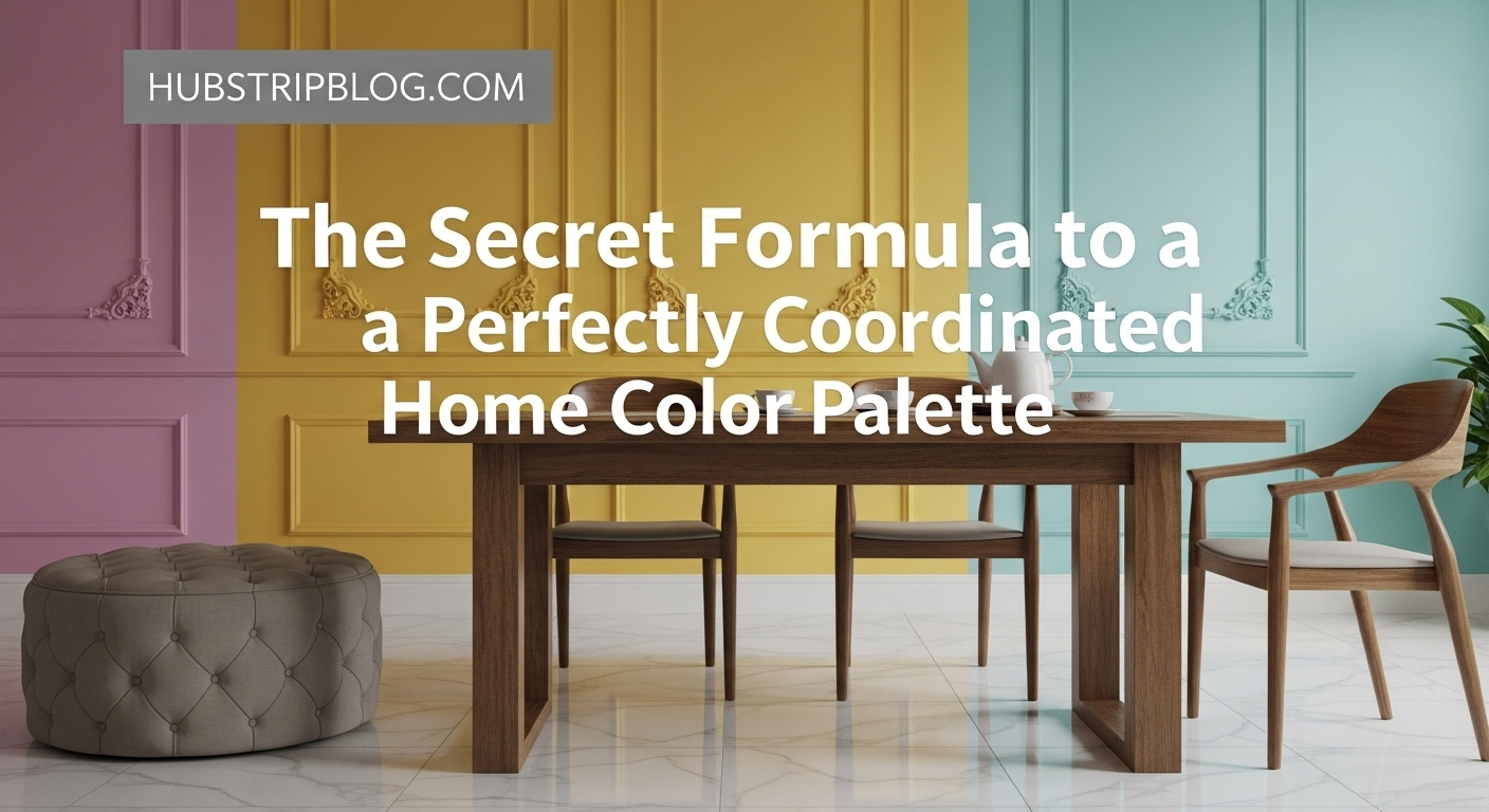
Perfectly Coordinated Home Color Palette – Embarking on a journey to create a beautiful home color palette begins with a solid understanding of color theory. This foundational knowledge provides the tools to make informed decisions, moving beyond guesswork to intentional design. Understanding the basics allows for truly cohesive home color palette ideas.
Color, at its core, is perceived through three main attributes: hue, saturation, and value. Hue refers to the pure name of the color, such as red, blue, or green. Saturation determines the intensity or purity of the color, from vibrant to muted. Value describes the lightness or darkness of a color, ranging from a pale tint to a deep shade.
The color wheel is an indispensable tool in color theory, visually organizing colors and showcasing their relationships. It illustrates primary colors (red, yellow, blue), secondary colors (orange, green, purple, formed by mixing primaries), and tertiary colors (created by mixing a primary and a secondary color). These relationships are crucial for developing cohesive home color palette ideas.
Colors also carry inherent temperature attributes, categorized as warm or cool. Warm colors like reds, oranges, and yellows tend to feel energetic, inviting, and can make large rooms feel cozier. Conversely, cool colors such as blues, greens, and purples evoke calm, serenity, and can visually recede, making small spaces feel larger and more open.
Understanding color harmonies is paramount for developing cohesive home color palette ideas. Monochromatic schemes use various shades, tints, and tones of a single color for subtle depth. Analogous schemes use colors adjacent to each other on the color wheel, creating a serene and pleasing flow. These are often easy to implement.
Complementary schemes use colors directly opposite each other on the color wheel, offering high contrast and vibrancy. For example, blue and orange create a dynamic pairing. Triadic schemes involve three colors equally spaced on the color wheel, providing a balanced yet bold combination. Tetradic or double complementary schemes use two pairs of complementary colors, forming a rich and complex palette. Each scheme offers distinct advantages for different design goals.

Initial Steps to Discover Your Personal Style and Color Preferences
Before diving into paint swatches, it’s essential to embark on a journey of self-discovery regarding your personal style and desired atmosphere. Your home should be a reflection of you, and this begins with honest introspection. Identifying what truly resonates with you is the first step towards cohesive home color palette ideas.
Consider the mood you wish to evoke in each room, as well as throughout your entire home. Do you desire a tranquil sanctuary, a vibrant gathering space, or a sophisticated formal area? Reflect on colors that inherently make you feel good, or colors that you are consistently drawn to in fashion or art.
Gathering inspiration is a highly effective way to refine your preferences. Create physical or digital mood boards using images from magazines, design blogs, Pinterest, or Instagram. Pay attention to not just individual colors, but also how different colors are combined and the overall feeling they convey. This creative exercise helps solidify your cohesive home color palette ideas.
Look for recurring themes in your inspiration – a particular shade of blue, a love for earthy neutrals, or a consistent preference for vibrant accents. Don’t limit your inspiration to interiors; nature, fashion, and travel can all offer unique insights into your color preferences. Document these findings diligently.
Finally, take stock of your existing belongings within your home. Do you have significant pieces of furniture, artwork, or rugs that you love and intend to keep? These items often contain colors that can serve as excellent starting points for your new palette. Incorporating existing elements ensures a smooth transition and helps achieve truly cohesive home color palette ideas. Your favorite ceramic vase or cherished heirloom quilt could hold the key.
Analyzing Your Home’s Architecture and Lighting
The architectural style and natural lighting conditions within your home play a crucial, often underestimated, role in how colors appear and interact. Ignoring these elements can lead to disappointing results, even with supposedly perfect paint choices. Thoughtful consideration here will vastly improve your cohesive home color palette ideas.
Natural light varies significantly depending on the compass direction of a room’s windows. North-facing rooms receive indirect, cooler light, which can make colors appear duller or more muted. Warm colors can help counteract this effect, bringing life to the space. South-facing rooms are bathed in bright, warm light throughout the day, making even cool colors appear vibrant.
East-facing rooms enjoy bright, warm morning light, which then transitions to cooler light in the afternoon. West-facing rooms experience the opposite, with cooler morning light and brilliant, warm light in the late afternoon. Understanding these shifts helps predict how your chosen colors will evolve throughout the day, ensuring better cohesive home color palette ideas.
Beyond natural light, artificial lighting sources are equally important. The type of light bulbs you use (incandescent, LED, fluorescent) and their color temperature (warm white, cool white, daylight) can dramatically alter a color’s perceived hue. Always test paint swatches under both natural and artificial light conditions that mimic your home’s reality.
The architectural style of your home also subtly influences appropriate color choices. A grand Victorian home might lend itself to rich, deep jewel tones or historical palettes. A modern, minimalist home often benefits from a more subdued, neutral scheme with splashes of bold or monochromatic accents. This shapes the foundation for cohesive home color palette ideas.
Farmhouse styles frequently embrace whites, creams, and muted grays with natural wood tones. Understanding these inherent stylistic biases helps narrow down your choices and ensures your palette feels authentic to your home. Do your research into classic palettes for your specific architectural era.
The Psychology of Color in Interior Design
Colors possess a profound ability to impact our emotions, moods, and even our behavior. Integrating color psychology into your design process allows you to intentionally craft the desired atmosphere for each space. This understanding is critical for developing truly cohesive home color palette ideas.
Red, a powerful and energetic hue, is often associated with passion, excitement, and warmth. While it can stimulate conversation and appetite, too much red can feel overwhelming or aggressive. Therefore, it’s often best used as an accent or in spaces where high energy is desired, such as a dining room or entryway.
Blue is widely recognized for its calming and serene qualities, evoking feelings of peace and tranquility. It’s an excellent choice for bedrooms and bathrooms, promoting rest and relaxation. Lighter blues can make a room feel expansive, while deeper blues add sophistication. Consider blues for spaces where calm is paramount when planning your cohesive home color palette ideas.
Green symbolizes nature, growth, and renewal, bringing a sense of balance and harmony to any space. It can be refreshing, soothing, and is versatile enough for almost any room in the house. Different shades deliver varied effects, from vibrant lime green to deep forest green. Greens promote a feeling of well-being.
Yellow radiates happiness, optimism, and warmth, injecting energy and light into a room. It can uplift spirits and stimulate creativity, making it suitable for kitchens, children’s rooms, or creative studios. However, overly bright yellows can sometimes feel too stimulating or even anxiety-inducing for some.
Other colors also carry significant psychological weight. Purple is often associated with royalty, creativity, and spirituality, while orange combines the energy of red with the happiness of yellow. Blacks and grays offer sophistication and modernity, forming excellent backdrops. White represents purity and simplicity.
By carefully considering the emotional impact of each color, you can strategically select hues that align with the specific function and desired feeling of every room. This mindful approach ensures your cohesive home color palette ideas not only look good but also feel good. Each choice contributes to the overall narrative of your home.
Building a Foundation: The 60-30-10 Rule
A highly effective and widely adopted principle for balancing colors in a room is the 60-30-10 rule. This simple guideline ensures visual harmony and prevents any single color from overpowering the space. It’s a cornerstone for creating cohesive home color palette ideas with ease.
The rule dictates that approximately 60% of the room should be your dominant color. This is typically the color used on the walls, or large furniture pieces like a sofa. It grounds the space and sets the overall tone, acting as the main stage upon which other colors will perform. Choose this color wisely.
The secondary color should then occupy about 30% of the room. This could be upholstery on accent chairs, drapes, an area rug, or a statement piece of furniture. The secondary color complements the dominant hue, adding interest and breaking up the visual monotony of a single color. It provides a visual bridge.
Finally, the accent color accounts for the remaining 10% of the space. This is where you can introduce bolder, more vibrant, or contrasting hues. Accent colors appear in small doses through decorative elements like throw pillows, artwork, vases, or small accessories. These small pops add personality and flair, completing your cohesive home color palette ideas.
The beauty of the 60-30-10 rule lies in its flexibility and adaptability. You can apply it to a single room, or it can be a guiding principle for your entire home’s palette, with variations in each area. It provides a practical framework, ensuring balance even when experimenting with daring choices.
This rule doesn’t limit you to only three colors; you can certainly layer multiple shades within each percentage. For instance, your 60% dominant color might include several tints and tones of blue. The key is to maintain the visual weight distribution. This structured approach simplifies the process of achieving sophisticated and cohesive home color palette ideas.
Expanding Your Palette Beyond a Single Room: Flow and Transition
While individual rooms benefit from their own unique character, a truly well-designed home achieves a harmonious flow from one space to the next. The “secret formula” involves expanding your color thinking beyond single rooms to encompass the entire home. This creates a more peaceful and unified experience, vital for cohesive home color palette ideas.
Imagine walking through your home; do the colors jar or clash as you move from room to room, or do they transition smoothly? Creating visual continuity is about guiding the eye effortlessly through the different areas, making the home feel larger and more intentional. This often begins with a whole-house approach.
This doesn’t mean every room must be the same color. Rather, it implies a thoughtful connection, perhaps through a shared underlying neutral, a recurring accent color, or a consistent commitment to a particular color temperature (e.g., all warm tones). Such strategies foster a sense of cohesion.
Achieving a seamless transition often involves careful consideration of “line of sight.” What colors are visible from a doorway or an open archway into the next room? These visual connections are critical for ensuring your cohesive home color palette ideas are successful across spaces. Avoid abrupt changes.
Think of your home as a story, with each room a chapter. The colors should tell a connected narrative, hinting at what’s to come or reflecting elements from where you’ve been. This overarching vision is what elevates a house from a collection of rooms to a truly integrated home.
A strategy might involve selecting a main neutral that extends through hallways and common areas. Then, varying the intensity, or introducing complementary shades of your dominant hue, as you move into private spaces. This creates variety while maintaining visual consistency.

Creating a Whole-House Color Scheme
Designing a whole-house color scheme requires an understanding of how colors interact globally, not just locally within a room. It’s about establishing a master plan that ensures every room feels connected, even if it has its own distinct personality. This master plan is essential for truly cohesive home color palette ideas.
Start by identifying a core neutral that will serve as your backdrop. This could be a warm off-white, a sophisticated greige, or a soft, cool gray. This neutral will flow through hallways, foyers, and other connecting spaces, acting as an anchor for the entire palette. It’s the unifying thread.
Once your core neutral is established, select 2-3 main colors that you love and that align with your personal style. These will be your primary players, used in varying degrees throughout different rooms. For example, you might opt for a soft blue, a muted green, and a rich terracotta.
Consider the relationship between these main colors. Are they analogous, complementary, or part of a harmonious triad? This relationship will dictate the overall mood and energy of your home. It’s important that these colors can coexist peacefully.
Next, decide on how these main colors will be distributed. One room might feature the soft blue predominantly, with hints of the muted green. Another room might reverse this, with green as the dominant and blue as an accent. This variation keeps things interesting without sacrificing cohesion. This creates dynamic and cohesive home color palette ideas.
Introduce a maximum of one or two accent colors that can be used sparingly across several rooms. These accents can provide a jolt of energy or a touch of surprise, tying disparate elements together. For instance, a vibrant yellow or a deep plum might appear in small doses throughout.
Think about how colors will transition from one room to another. One effective technique is carrying a secondary color from one room into the next as an accent. For example, if your living room has blue walls and green accents, the dining room might have neutral walls with blue and green accents.
Another strategy is to vary the shade or tint of a single hue. A deep navy in the master bedroom might lighten to a sky blue in an adjoining bathroom. This evolution of color maintains continuity while offering visual interest, leading to sophisticated and cohesive home color palette ideas.
Your whole-house scheme should also consider the existing elements in your home, like flooring, fixed cabinetry, or inherent architectural features. These elements often have dominant colors or undertones that need to be accounted for in your selections. Work with what you have where possible.
Incorporating Texture, Pattern, and Materials into Your Palette
Color is not solely about paint; it’s about the entire tactile and visual experience of a space. Incorporating texture, pattern, and various materials is crucial for adding depth and richness to your home without necessarily introducing new hues. These elements are vital for truly cohesive home color palette ideas.
Texture adds a physical dimension to your palette. A velvet sofa in a deep blue will feel different and reflect light differently than a linen sofa in the same shade. Textures create visual interest and contribute to the overall warmth or coolness of a room, even within a monochromatic scheme. Think about the play of light.
Consider the various textures present: the softness of a plush rug, the coarseness of a woven basket, the smoothness of polished wood, or the rough appeal of stone. Each texture interacts with light and color in unique ways, adding complexity without overwhelming the palette. Layering textures is key.
Patterns introduce visual rhythm and can be a powerful way to incorporate secondary or accent colors into a scheme. A patterned rug, wallpaper, or throw pillows can subtly feature hues from your palette, linking elements across the room. Variety in scale of patterns is important for design interest.
When using patterns, strive for a mix of scales: a large-scale pattern on a rug, a medium-scale pattern on curtains, and a small-scale pattern on throw pillows. This layering prevents the space from feeling too busy. Ensure the background colors of your patterns align with your dominant hues.
Materials also have their own inherent colors and textures that contribute to the overall palette. Natural wood tones, metallic finishes (gold, silver, brass), and stone selections (marble, granite) are all integral parts of your color story. These are often fixed elements.
These materials can introduce warm or cool tones, and their natural variations add organic depth. For instance, a warm-toned wood floor will influence the paint colors chosen above it. Using a consistent metallic finish throughout the home can also be a subtle way to create cohesive home color palette ideas.
Therefore, when planning your colors, consider every element in the room, not just the paint on the walls. Fabrics, finishes, and furnishings all contribute to the overarching success of your palette. A holistic approach is what creates truly professional-looking spaces.
The Role of Neutrals in a Coordinated Home
Neutrals are the unsung heroes of many beautifully coordinated homes, providing a canvas that allows other colors to shine while also creating a sense of calm and sophistication. They are far more diverse than simple beige or white, offering a vast spectrum for cohesive home color palette ideas.
Beyond classic white, gray, and beige, consider “greige” (a blend of gray and beige), off-whites with various undertones, and even very pale, desaturated versions of other colors like sage green or dusty blue. These nuanced neutrals add character without being overwhelming. They serve as excellent backdrops.
The power of a good neutral lies in its ability to provide a clean, uncluttered backdrop, allowing artwork, furniture, and accent colors to pop. Neutrals also create a sense of spaciousness and light, making rooms feel larger and more open. This is particularly useful in smaller homes where flow is crucial.
Understanding the undertones of neutrals is vital. A “warm” gray will have hints of beige, yellow, or pink, while a “cool” gray will lean towards blue or green. Choosing neutrals with compatible undertones across your home maintains a sense of harmony. Mixing warm and cool undertones carelessly can lead to a disjointed feel.
Neutrals can also carry personality themselves. A deep charcoal gray can be dramatic and modern, while a creamy off-white communicates warmth and tradition. Their versatility makes them indispensable for creating varied yet cohesive home color palette ideas across different rooms.
Moreover, neutrals are incredibly forgiving. They pair well with almost any other color, making future redecorating easier. If you want to change your accent colors from blue to yellow, a neutral backdrop will accommodate this shift with minimal effort. This makes them a wise long-term investment.
Ultimately, neutrals provide the necessary visual rest for the eye, allowing the more vibrant elements of your design to be truly appreciated. They unify spaces, ensuring that even rooms with very different accent colors still feel part of the same home. This foundational role cannot be overstated for cohesive home color palette ideas.

Strategic Use of Accent Colors and Metallics
Accent colors and metallics are the punctuation marks of your home’s color palette, adding personality, sparkle, and definition. Used strategically, they can tie disparate elements together and inject vibrant energy without overwhelming the space. They are crucial for refining cohesive home color palette ideas.
Accent colors, typically the 10% in the 60-30-10 rule, are perfect for injecting small, impactful bursts of complementary or contrasting hues. Think throw pillows, decorative objects, artwork, fresh flowers, or a statement piece of furniture. These small elements have significant visual weight.
These pops of color can be used to emphasize architectural features, highlight a piece of art, or simply to add an unexpected moment of joy. They provide an opportunity for creative expression and can be easily changed out with the seasons or evolving tastes, offering flexibility.
Metallics, while often overlooked in basic color discussions, act as powerful neutrals and enhancers. Gold, brass, copper, silver, and black metal all have distinct characteristics that can influence a room’s overall feel. They reflect light and add a crucial layer of sophistication.
Warm metallics like gold, brass, and copper add luxury and warmth, pairing beautifully with rich jewel tones or earthy neutrals. Cool metallics such as silver, chrome, and brushed nickel lend a modern, crisp feel and complement cooler color palettes. Mixing metals can work, but do so intentionally.
Using a consistent metallic finish for hardware, lighting fixtures, and decor across several rooms can subtly unify your home’s aesthetic. This continuity contributes to cohesive home color palette ideas by adding a refined, almost imperceptible, layer of design. It’s a professional touch.
Accent colors and metallics are also excellent tools for creating repeating elements throughout your home. A particular shade of emerald green in a piece of art in the living room could be repeated in a small vase in the dining room and a throw pillow in the bedroom, subtly tying the spaces together. This is a subtle yet effective way to achieve unified spaces.
They are the details that elevate a good design to a great one, allowing you to showcase your personality and refine your established palette. Don’t underestimate the power of these smaller elements in making your interior design feel complete and harmonious, leading to impressive cohesive home color palette ideas.
Troubleshooting and Refining Your Color Palette
Even with careful planning, sometimes a color palette doesn’t quite hit the mark. Troubleshooting and refining your choices are crucial parts of the design process. Don’t be afraid to make adjustments; perfection is achieved through iteration. This iterative process refines your cohesive home color palette ideas.
One common mistake is ignoring the impact of undertones, particularly in neutral paints. A supposedly “white” wall might have a pink or yellow undertone that clashes with your cooler furnishings. This often results in a feeling of unease without knowing why. Always test colors in situ.
Another pitfall is using too many colors or too many competing bold colors within a single space, leading to visual chaos. A room should feel restful and inviting, not overwhelming. Stick to the 60-30-10 rule as a guideline and simplify if a space feels too busy. Less can often be more.
Ignoring natural and artificial light when selecting colors can lead to disappointment. A color that looked perfect in the store might appear entirely different in your home’s specific lighting conditions. Always, always test paint swatches on your walls. Paint large enough samples to get a real feel.
Test paint colors by painting large swatches (at least 2×2 feet) on several walls in a room. Observe them at different times of day and under various lighting conditions. This investment of time prevents costly mistakes and ensures your cohesive home color palette ideas will truly work.
Don’t be afraid to live with your choices for a short while before making final decisions, particularly with paint. Sometimes a color needs a few days to settle into the space, and your perception might change after integrating furniture and decor. Give it time to breathe.
If after careful consideration and testing, a color still doesn’t feel right, be prepared to adjust. That might mean repainting a wall, swapping out an accent piece, or softening a bold choice. Design is iterative, and learning from what doesn’t work is just as valuable as finding what does. This flexibility is key to refining your cohesive home color palette ideas.
Finally, if you find yourself truly stuck or overwhelmed, consider consulting a professional interior designer. They possess an expert eye and knowledge of color theory that can help you navigate complex decisions, saving you time and money in the long run. A professional can provide invaluable input.
Conclusion: The Art of Cohesive Color
The secret formula to a perfectly coordinated home color palette is not a single magic trick, but rather a deliberate blend of understanding color theory, embracing personal style, and applying strategic design principles. It’s a journey of thoughtful choices, from recognizing the impact of light to harmonizing textures and patterns. By following these steps and considering these insights, you are well-equipped to create cohesive home color palette ideas that truly sing.
Your home is a sanctuary, and its colors should reflect the peace, joy, and comfort you seek. Embrace the process with an open mind, be willing to experiment, and trust your instincts. The result will be a home that not only looks beautiful but also feels authentically yours, a testament to the transformative power of a well-chosen and perfectly coordinated color palette.
